
ZILCODE ADMINISTRATION
1 Open Zilcode
1.1 Login Zilcode
- Open web page https://demo.zilcode.com/index.html

- Fill in the information Username.SiteCode, Password and click Login to log in. Note that the company code (site code) will be provided by the software when you purchase or register to use ZilcodeCloud.
- Check Remember to save the username and password for future logins
1.2 Choosing a role
- If a user has more than one role the software will ask the user to select a role before using the software.

- Select Role as System Role then click Ok to select the administrative role when using the software
1.3 System applications

- To create and configure applications, the administrator uses the system applications on the tools menu by clicking the button on the toolbar (far right).
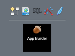
Zilcode system apps include
- App Builder – The main tool for creating and managing apps dụng

- SQL Cloud – Create and manage tables/views/data execution code on Zilcode's cloud data service

- Workflow Designer – Design and manage workflows

- HTML Report – Create and manage simple html reports

- Data Analyst – Data design and analysis

- Source Editor – Source code editor

This document will guide you through using the above mentioned apps to create and configure an application without writing code.
2 SQL Cloud – Database management
It is a system application that helps administrators create and manage tables/views/data execution codes on the cloud service provided by Zilcode. With SQL Cloud, users can define and store data in the form of data tables or combine tables to create views.

In SQL Cloud, on the left panel, data tables are grouped under TABLES, data views are grouped under VIEWS, and scripts are grouped under PROCEDURES.
To filter objects by name, enter at least two characters in the search box and press Enter

Objects whose names contain the new search string are displayed.
2.1 Data table
2.1.1 View and edit table information
Click a table in the TABLES group in the left panel to select and view information about the data table.

Table information includes table name, alias, capacity used and creation date.
- To rename a table or alias, click the button ✏️ bên cạnh tên của bảng

Edit the Name and Alias information, click the Ok button to change the name and alias of the table
The list of columns of the table is listed in the Column tab. The information of the column includes:
- ID
- Name
- Alias
- Data Type
- Default Value
- Length
- Precision
- Nullable
- Primary Key
- Identity
To change the name or properties of a column, select the property you want to edit and click Edit (or double-click), then enter the information directly in the grid. Click Save to save your changes.

To add a new column, click Add New.

Enter the information of the new column then click Save to save.
To delete a column, select the column to delete and click Delete

Click the Yes button to confirm you want to delete the selected column
To view the table data click the Data tab

To change table data, select the data to edit and click Edit (or double-click) then enter the data directly on the grid. Click Save to save the changes.

To add a new data row, click Add New.

Enter the information of the new row then click Save to save.
To delete a data row, select the data row to delete and click Delete
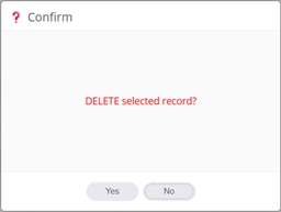
Click the Yes button to confirm you want to delete the selected data row
2.1.2 Create new table
To create a new data table, click the button ➕to the right of the TABLES item in the left panel

Enter the table name in the Name box, the alias in the Alias box. Click Add New in the Columns grid to add new columns to the table (you can also edit or delete the newly added columns similar to the operation described above). Note that a table must have at least one column and must have a primary key. Click the button 💾 to save the table.
2.1.3 Delete table
In the left panel click the ➖ button next to the table you want to delete

Click Yes to confirm you want to delete the selected table. Note that when you delete a table, all data in the table will also be deleted.
2.2 View
2.2.1 View and edit view information
Click a view in the VIEWS group in the left panel to select and view information about the data view.

View information includes the view name, alias, and creation date.
- To rename a view or alias, click the ✏️ button next to the view name
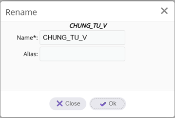
Edit the Name and Alias information, click the Ok button to change the name and alias of the view
The list of columns of the view is listed in the Column tab. The column information of the view is immutable (if you want to change it, you need to edit the script of the view)
To view the data of the view, click the Data tab

Note that the view data cannot be changed.
To edit the view script, click the Script tab

Change the view script directly then click the 💾 button next to the Script tab to save

Click the Yes button to confirm view editing.
2.2.2 Create new view
To create a new data view, click the ➕ button to the right of the VIEWS item in the left panel.

Enter the view name in the Name box, the alias in the Alias box. Write the view script in the Script box. Click the 💾 button to save the view.
2.2.3 Xóa view
In the left panel, click the ➖ button next to the view you want to delete.

Click Yes to confirm you want to delete the selected view.
2.3 Procedure
2.3.1 View and edit procedure information
Click on the script in the PROCEDURES group in the left panel to select and view information about the procedure.

Procedure information includes procedure name, alias and creation date.
- To rename a procedure or alias, click the ✏️ button next to the procedure name

Edit the Name and Alias information, click the Ok button to change the name and alias of the executable code
The list of parameters of the executable code is listed in the Parameters tab.
To edit the script of the executable code, click the Script tab

Change the parameters and script of the executable code directly then click the 💾 button next to the Script tab to save

Click the Yes button to confirm editing the executable code.
2.3.2 Create procedure
To create a new procedure, click the ➕ button to the right of PROCEDURES in the left panel.

Enter the procedure name in the Name box, the alias in the Alias box. Write the procedure script in the Script box. Click the 💾 button to run the procedure.
2.3.3 Delete procedure
In the left panel, click the ➖ button next to the procedure you want to delete.

Click Yes to confirm that you want to delete the selected procedure.
2.4 Query data
To query data from the left panel, click the Query button.

Enter the query command content. Supported query commands include
- Select: Query data
- Insert: Add new data
- Update: Update data
- Delete: Delete data
- Exec: Run executable code
Click the Excute button to execute the query command, the query results will be displayed on the grid

3 App Builder – Building applications
App Builder is an application that allows administrators to create a nocode application and manage all the components related to that application.

AppBuilder provides you with the following functions:
- Site: Your company information
- Data Service: Declare the data services to use
- Organization: Organization hierarchy
- User: User
- Role: Role
- Applications: Created applications and system applications
The interesting point is that AppBuilder itself is also a nocode application created from Zilcode. Refer to the document “Zilcode User Guide” to know how to use a nocode application.
3.1 Site – Company information
When purchasing or registering to use ZilcodeCloud, users will be given a company code (SiteCode) based on the information provided by the customer. SiteCode is a unique short string of characters to identify the customer (usually an abbreviation). In addition to SiteCode, you can add customer information in the Site window.

In the Site tab you can update the information
- Site Name*: Company name
- Site Code*: Customer code
- Description: Company description (bilingual support)
- Icon: Customer brand image
- Backgroud: Background image of the screen after the user logs in
- Contact: Contact phone number
- Address: Company address
- License: Purchased copyright information
Note that Site information will appear in the application interface of that Site
If the customer company has many branches, you can define the branch hierarchy in the Organization tab. Organization is a hierarchical structure, you define ParentID to identify the parent element in the hierarchical tree structure.

Information of Orginzation includes
- OrgName*: Branch name
- Description: Description of the branch
- Active: Is it still active?
- ParentID: Parent branch in the hierarchy
- SeqNo*: Sequence number appearing in the hierarchy (note that the child sequence number must be smaller than the parent sequence number)
Note that the user belonging to an Orginzation will only have access to the data of that Orginzation.
3.2 Service – Data services
Services are data services provided via web protocol so that applications can easily access them as long as there is an internet connection.
When you purchase or register to use ZilcodeCloud, the software will provide you with the SQLCloud service. The software has already declared the parameters of this service, you do not need to declare anything more.

For other data services you must declare the parameters yourself:
- ServiceName*: Data service name
- ServiceType*: Data service type. Currently the software supports the following types of data services:
o SQLRest: Data service provided by Zilcode based on SQLServer database

o PostgRest: Data service provided by PostgREST based on PostgreSQL database (in development)

o ArcGIS: Map services provided by Esri
o Mapbox: Map service provided by Mapbox (in development)

You need to refer to the service type specification document to know how to declare and use the service.
- Description: Description of the data service
- URL*: URL path of the data service
- AccessUser: Account name using the data service
- AccessPass: Password of the account using the data service
- SeqNo: Sequence number (only applicable to map services, according to regulations, an application will only have one map, so the service in an application with the smallest sequence number will be selected)
- Credential: According to regulations by database name and data space name (database_name.schema_name)
A data service will provide access to one or more data tables. Select a service and click the ImportTables tool to import the table configuration from the source database (Note that you need to import the table configuration before using it in AppBuilder)

The software will list all tables from the selected data service. Select the table to import the configuration, note that each table only needs to import the configuration once (imported tables will not be selected anymore). Click Ok to import the configuration of the selected tables
To grant/remove permission for the SQL Cloud application to access the data service, select that service and click the Allow SQLCloud tool

Click the Yes button to confirm granting/removing access to the SQL Cloud application
3.2.1 Table – Data table
An imported table will have the configuration of the table itself and a list of configurations of all columns of that table.

Input form

- URL: Only used when the data access address of the table is different from the data access address of the service (Usually only applies to map data services).
- HasAttachment: Whether the table allows file attachments or not.
- IsReadonly: Whether the table is read-only or not.
- IsCache: When the table data is a category, set IsCache=true so that the software can preload the table data to speed up lookup.
- ArchiveType: Whether to store when editing/deleting table data or not. There are two types of storage:
o Auto: Automatically store when the user edits/delete table data.
o Manual: The user specifies whether to save or not before performing the edit/delete operation on the table
- BeforeChange: The extension code (plugin) is executed before the table has a change in data (add, edit, delete)
- AfterChange: The extension code (plugin) is executed after the table has a change in data (add, edit, delete)
- MapLayer: The identifier of the map layer attached to the table (only used with the map service)
If the table in the source database has a configuration change such as adding new or editing the name of the data column, click the Add Mis-Columns tool to add the configuration of these data columns (note that this operation only adds, not deletes, so you need to delete it yourself if the column configuration no longer exists in the source database)
3.2.2 Column – Columns in a table
The column configuration of the data table will have the following information:

- ColumnName*: Column name
- Alias: Alias of data column
- DataType*: Data type information of column retrieved from database
- DefaultValue: Default value of column when adding new
- Length: Allowed data length of column (cannot store data larger than allowed length)
- IsNotnull: Whether column allows to store empty (null) values or not
- ColumnType: Data column type. The software defines the following column types
o Key: The column is the primary key
o Code: The column is the search code used in the search box in the data entry form
o Display: The column is the display value of the category (domain)
o Find: The column is used to search in the Search tool of the map
o Lock: The lock column value will determine whether the corresponding record is allowed to be edited/deleted
o Tree: The column is linked to the parent record (used with data with parent-child hierarchy)
o Orgnization: The column value is the organization code used to authorize data according to Organization
- SeqNo*: The column number in the table
- DomainID: The value of the column is looked up from this domain
- LinkTableID: The value of the column is linked to this table. The column with information about LinkTableID is the foreign key (ForeignKey) of the data table.
In the example below table N_WINDOW is many-to-one (n-1) with table N_APP using appid column of the two tables.

The appid column configuration of the N_WINDOW table will be as follows (see the selected row in the Column tab)

3.3 User
Each user will have a login account to use the software managed in User.

User is a user of the software including information
- UserName*: Login account
- UserCode: User code (usually used as employee code)
- FullName: Full name of the user
- Password*: Login password
- PIN: Secret number that can be used instead of password (used in case the device only supports numeric keyboard)
- Tag: Extended information that comes with the user
- Active: Is the user still active or not (inactive users will not be able to log in to the system)
- IsViewer: The user is only allowed to read data without the right to change or edit data
- IsSystem: The user has the right to use system-level applications (AppBuilder, Workflow Designer, HTML Report, SQL Cloud, Source Editor…)
- ParentID: The user's direct manager (hierarchical tree structure)
- Email: The email address of the user user
- Phone: Contact phone
- Description: User description
Click Save to save the changes.
3.4 Role
A role is a group of permissions described in a Role. Users with the same role will have the same Role. A user can have many Roles, Role is the basis for assigning permissions to users.

A role has the following information
- RoleName*: Role name
- Description: Description of the role
- SeqNo: The serial number displayed in the role selection form after logging in (user has multiple roles)
To assign a role to a user, select the role then in the User tab, click the 🔗 button

Check/uncheck the corresponding user to assign/unassign the user to the role
With a role you can define the following permissions
- Application: The application that the role is allowed to use. Click the 🔗 button to assign the application to the role
- Menu: The menu in the application that the role is allowed to use. Click the 🔗 button to assign the menu to the role
- Tool: The tool in a window that the role is allowed to use. Click the 🔗 button to assign the tool to the role
- Access: Restrict access to a data table. Click the 🔗 button to add access restrictions

o TableID*: Access Restricted Table
o NoSelect: Not allowed to view data
o NoInsert: Not allowed to add new data
o NoUpdate: Not allowed to modify data
o NoDelete: Not allowed to delete data
o NoExport: Not allowed to export data
o AllowLock: Allow to lock data for each record (locked records will not allow editing)
o AllowArchive: Allow to save data before editing.
3.5 Organization
A company can have many branches (Organization), the branches will often have the same way of operating but work with data of each branch. Organization is used to define branches allowing users in the whole company to use data in the same table (this table needs a column with ColumnType=Organization). However, the data rows are decentralized so that only users of that branch have access to the data row of a branch.

Refer to 3.1 to view the information of an Organization
To assign a user to a branch, select a branch and click the 🔗 button

Check/uncheck the corresponding user to assign/unassign the user to the branch
3.6 Application
Application is where users configure to create nocode applications in Zilcode.

An app has the following information:
- AppName*: Name of the app
- Translate: Name of the app translated into another language.

- Description: Description of the application
- AppType*: Type of application. There are the following types
o Application: Normal application
o GIS Application: Application with map
o Engine: Additional application called from a url
- SeqNo: Order of application appearing on the home page (desktop) after user logs in

- IsSystem: System application
- Icon: The application's icon image
- Color: The application's background color
- Theme: The theme (color, style) of the interface (see 1.1). If an application is assigned a theme, this theme will be used when opening the application instead of the theme the user selected in the login form
- LinkUrl: The url address to call the application (only applicable to Engine applications)
- StartExec: The extension code (plugin) that is executed after the application is launched
An application will use one or more data services (services). To allow the application to use which Service in the Service tab, click the 🔗 button

Check/uncheck the corresponding Service to assign/unassign the Service to the application
A nocode application will include the following components
- Window
- Menu
- Workflow
- Report
- Domain
Note that all the above components can be defined through the wizard by selecting an Application and clicking the AppWizard tool (Refer to 3.7)
3.6.1 Window
Window is the application's data presentation window, Window is the main interface that allows users to interact with data (search, view, add, edit, delete...).

Window has the following information:
- WindowName*: Window name
- WindowType*: Window type. Currently there is only one window type, Window
- Translate: Window name translated into another language
- ExecName: Extension code (plugin) executed after the window is initialized
- IsOpenFind: Opens the search dialog box immediately after the window is opened.
Normally, a window will include a main tab and many child tabs. The tabs in the window are nested parent-child hierarchies (child tabs are in the parent tab) and can be arranged on multiple rows (levels) in the window. Each tab in the window corresponds to data from a table. To build tabs for a window, select a window and click the Build Tabs tool

- Select the data table displayed in the main tab in the MainTab* combo. Select the data tables of the child tab in the list of data tables listed below. Click the BuildTab button to create tabs corresponding to the selected data tables. Note that the software will search for the column with LinkTableID information to serve as the basis for building the parent-child tree hierarchy between tabs. Therefore, it is necessary to configure the LinkTableID information of the related tables before BuildTab (Refer to 3.2.2)
The automatically built tabs will only include the most basic configuration. It is necessary to fine-tune the properties of the tab to achieve higher efficiency.
After configuring the window, click the DeyployWindow tool to put the window into use (You must deploy the window before using). Click the PreviewWindow tool to preview the window.
To edit and rearrange the layout of the window, click the DesignLayout tool (Refer to 3.6.2)
3.6.1.1 Tab – Input form
Tab is where data of a table is presented, a tab will have many fields each field corresponds to a column of the data table.

The information of a tab includes
- TabName*: Tab name
- Translate: Tab name translated into another language
- LayoutCols: How many columns the input cells are arranged in (default value = 3)
- LabelSpan: Width of the label part of the input cell (default = 6). If you want the label to be above the input cell, set LabelSpan=-1
The example below is a tab with LayoutCols=2 and LabelSpan=-1

- TabLevel*: In a window, tabs can be arranged on multiple rows. TabLevel determines the row position of the tab in the window. By convention, the first row has TabLevel=0, the next rows are =1, =2...
The example below is a window with 3 rows of tabs

- SeqNo*: The tab's order number in the window. Note that the SeqNo of the child tab is always smaller than the parent tab.
- ParentTabID: The parent tab in the hierarchy
- TableID*: The tab's data table
- WhereClause: By default, the tab will display all data in the table. If you want the tab to display only part of the table's data, set WhereClause for the tab
- OrderBy: The order in which the table's data rows are displayed in the tab.
- FilterFields: Sets data filters on one or more columns of the table in the tab.
FilterFields is one or more names of filter columns and the corresponding default filter value. The filter column must be configured to be associated with a category (see 3.6.4) or a cached data table (IsCache=true). The filter will list the values in this category or cache table for the user to choose from and when a value is selected the filter will use this value to filter the tab data. The default filter value, if any, will be applied by the filter as soon as the tab is opened.
The example below allows filtering data by Year, Month, Day and Area Code columns where the Year column has a default filter value =2025.


- FilterClauses: Sets a filter from a search condition (where).
FilterClauses are one or more pre-defined search conditions for the user to select. When a search condition is selected, the filter will apply this condition to filter the tab's data.
The example below allows filtering data based on the conditions: Age less than 10, Age between 10 and 16, and Age greater than 16.


- IsViewOnly: The user is only allowed to view the data.
- WorkflowID: Tab that participates in the workflow (View)
- WindowID*: Window of the tab
The tabs in the window are built from tables in the database and will automatically link together through the configuration of LinkTableID and ParentTabID. In case you do not want to use LinkTableID but want to define these relationships separately, please configure the following information of the tab
- LinkChildField: Field name linked to the child table
- LinkTableID: Link table
- LinkParentField: Field name linked to the parent table
- RelateTableID: Intermediate table
- RelateChildField: Field name linked to the child intermediate table
- RelateParentField: Field name linked to the parent intermediate table

If the data table corresponding to the tab has a configuration change such as adding new or editing data column names, click the Add Mis-Fields tool to add the configuration of these data columns (note that this operation only adds, not deletes, so you need to delete it yourself if the column configuration no longer exists in the source data table).
3.6.1.2 Field
A tab will consist of many fields. A field is an input box corresponding to a column in a data table..

Field has the following information:
- FieldName*: Name of the information field (automatically obtained by alias or name of the corresponding column)
- Translate: Name of the information field translated into another language
- ColumnID: Column of the data table corresponding to the information field
- FieldType*: Type of input cell of the information field. The software supports the following input fields
o Alphanumeric: Input field that only allows alphanumeric characters
o Array: Array of multiple values in order
o Checks: List of check boxes
o Checkbox: Single check box
o Color: Color check box
o Combo: Auto-complete input field
o Currency: Number input field with currency format
o Date: Date check box
o Datetime: Date and time check box
o Email: Email input field
o Enum: Input field that allows selecting one or more elements
o File: File upload input field
o Float: Real number input field
o Hex: Hex number input field
o Html: Text input field with html format
o Int: Integer input field
o Map: Key/value object input field (JSON)
o Password: Password input field password
o Percent: Percent input box
o Radio: List of radio input boxes
o Text: Text value input box
o Textarea: Long text input box
o Time: Time selection box
o Toggle: Switch input box
o Select: Select a value in a list taken from a category (domain) or from a linked table (LinkTableID)
o Search: Search input box to select a value from a linked data table (LinkTableID).
Note that if there is a lot of data in the linked table, then select the Search field type, otherwise select the Select field type
o Point: Input box for point coordinate values in the map
o Polyline: Input box for line coordinate values in the map
o Polygon: Input box for area coordinate values in the map
Refer to the image below for a clearer description of the input box types

- FieldGroup: Is a group of information fields. Fields with the same FieldGroup value will belong to the same group. Note that a FieldGroup can only be on one column on the tab (for more flexible field arrangement, refer to 3.6.2).
For example, the FirstName, LastName, Middle Name fields have a field group of “General” and the Other field has a field group of “Additional Info”

- SeqNo*: The display number of the information field in the tab
- DefaultValue: The default value of the input box (the value automatically filled when adding new data)
- PlaceHolder: Input instruction
- Format: The format of the input box.
The input box format allows you to specify that the input data should match a format pattern (pattern). Pattern is a standardized string of characters that defines an input pattern. For example, [a-zA-Z0-9] is a pattern that matches a string of any length, as long as the string contains only lowercase letters (a-z), uppercase letters (A-Z) or numbers (0-9).
- IsRequire: Required to enter a value when adding a new or editing field (cannot be blank)
- IsReadOnly: The field is read-only (cannot be edited)
- IsFrozen: Freezes (does not scroll) the field when displayed in grid form
- HideInGrid: Does not display the field when in grid form
- HideInForm: Does not display the field when in form form
- HideInSearch: Does not display the field in the search form
- FieldLength: The length of data allowed to be entered (max length)
- DisplayField: The length displayed on the form of the data cell (number of pixels)
- Options: Additional information for the input field
- ColSpan, RowSpan, ForeignWindowID: Not used
- Calculation: An expression that calculates the value of the field when the referenced fields in the expression change. Note that in the expression, the reference fields are enclosed in square brackets [field name] in which the field belonging to the parent tab needs to add the table name before the field name [table name.field name].
For example: The Calculation configuration of the LineNet result field is [QtyInvoice]*[Price]*[Orders.Rate]. When changing the reference field value (QtyInvoice, Price, Rate), the LineNet result field value will be automatically recalculated (5*100*25,000=12,500,000).

- DisplayLogic: Is an expression that determines whether the field is displayed on the form or not. If the value of DisplayLogic=false, the field will not be displayed on the form.
For example: The DisplayLogic configuration of the two files BeforeChange and AfterChange is [tabletype]==”table”. Then both fields will only be displayed when the value of table type = “table”.

When selecting tabletype as “view” both fields are not displayed.

- WhereClause: Is the condition to limit the selected values (only applicable to Select or Search field types, where WhereClause will be used to limit the values)
- ParentFieldID: The parent field of the current field. If the parent field changes, the value or selection list of the child field will be limited by the search condition columnkey=parent field value
For example: the Region field is configured with a link (LinkTableID) to the data table

and has the parent field (ParentFieldID) as Market then the selection list of the Area field will change as follows


- WhereFieldName: Used to replace columnkey in the above search condition, then the search condition will be WhereFieldName= parent field value
- BindFieldName: Used with ParentFiledID in case the parent field is Search or Select. Then the child field will automatically receive the BindFieldName value from the parent field.


3.6.1.3 MenuTool
In a tab there can be one or more tools on the toolbar. Usually the tools are used to open a report or execute an extension code (plugin - is a piece of programming code in javascript language that executes according to a specific request)

Tool information includes:
- MenuName*: Tool name
- MenuType*: Always equal to “tool”
- Translate: Tool name translated into another language
- ParentID: Tools can be arranged as a menu. ParentID points to the parent tool in the menu.

- ExecName: File name containing the extension code (plugin) to be executed when the user clicks the tool
- ReportID: Report (reference 5) or analysis (reference 6) to be called when the user clicks the tool
- SeqNo*: The serial number of the tool on the toolbar. Note that the child tool must have a serial number greater than the parent tool
- Icon: The icon image of the tool
- WindowID*: The window of the tool
3.6.2 Window Layout
By default, the input cells (fields) on the tab in the window will be laid out in columns with the number of columns equal to the LayoutCols (default = 3) of that tab in the order (SeqNo) of the field arranged from left to right and from top to bottom. You can design your own layout grid for the window by clicking the LayoutDesign tool
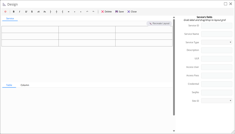
By default, each tab has a layout that is a grid of 3 columns and 3 rows (3x3). You can recreate the layout grid for a tab by selecting the tab and clicking the RecreateLayout button.

Enter the number of columns and rows of the grid and click the Ok button to create the layout grid for the tab

Select a grid cell by clicking on it, then right-click and choose the following operations to change the grid layout:
- Merge: Merge two or more adjacent cells
- Unmerge: Unmerge
- InsertRow: Add a row at the current position
- DeleteRow: Delete a row at the current position
- InsertColumn: Add a column at the current position
- DeleteColumn: Delete a column at the current position
- InsertGroup: Add a group at the current position. Note that when designing a layout for a tab, the FieldGroup value will be ignored

Enter the group name, number of rows, number of columns and click the Ok button to create the group
The example layout below is the result of merging two cells in row 2 and adding a 2x2 group named Detail to the layout grid with 2 columns and 4 rows.

- DeleteGroup: Delete the group at the current position
When selecting a tab in the design window, the list of fields of that tab will be listed in the right panel. Drag and drop the fields in the right list into the grid and vice versa to arrange the fields in the desired position on the tab.

DesignLayout provides users with additional tools to directly edit layout content such as adding text, changing text style... To start editing the layout, click the 🎨 button on the toolbar.

The example below changes the style of the input box label as well as adding completely new text to the layout.

Click the Save button to save the design you have made
Click Delete to delete the entire layout. Note that when you delete the window, there will be no layout and the default layout will be used (arranging the input fields in rows and columns).
3.6.3 Menu
The menu is the main functional menu of a nocode application. Menus are a parent-child tree structure where the parent menu only acts as a sub-group (does not trigger events)

Menu parameters
- MenuName*: Menu name
- MenuType*: Menu type has the following types
o Menu: normal menu
o ShortCut: menu appears in the header position of the application

- Translate: Menu name translated into another language
- LinkWindowID: Window opened when the user clicks on the menu
- ReportID: Report/Analysis opened when the user clicks on the menu
- ExecName: File name containing the extension code (plugin) executed when the user clicks on the menu
- Icon: Icon image of the menu
- SeqNo*: The menu's sequence number on the application's menu. Note that the submenu must have a sequence number greater than the parent menu
- ParentID: Menus are a tree-like hierarchical structure. ParentID points to the parent menu in the application menu
- WhereClause: The search statement limits the data to the first tab of the window opened from the menu
- ShowSummary: Displays the count of data (count) in the first tab of the window opened from the menu
- IsOpen:
o At parent level: The menu expands or collapses
o At leaf level: Activates the menu immediately after opening the application
- MapLayer: The identifier of the map layer associated with the menu (only used with map services see section 7).
- Subtype: Additional to MapLayer the identifier of a sublayer of a map layer
3.6.4 Domain
Domain is a list of valid values. Domain is often used in Select input boxes to help users choose valid values from the list.

Domain attributes:
- DomainName*: Domain name
- DomainType*: Domain data type. There are two types
o Text: Text data
o Number: Numeric data
- Description: Describes the meaning of the domain
- Domain*: Domain content. The content includes a list of arrays with the first element being the value and the following elements being the explanation [Value, Display, Color, Lock]
o Value: Domain value
o Display: Value display
o Color: Value color when displayed in the Select box
o Lock: 0 or 1 corresponding to allowing/disallowing data editing

3.7 Application Wizard
Wizard is a utility that helps you create new applications in ZilCode by following the steps in order. In the Application window, click the AppWizard tool to start.
3.7.1 Step 1 – User & Organization
Instructions for configuring users and organizations in the company

- Select the user in the user list box and check the checkbox corresponding to the organization to assign the user to the checked organization
- Click the ✏️ button to edit, click the AddUser button to add a new user (Refer to 3.3)

- Click the ✏️ button to edit, click the AddOrganization button to add a new branch (Refer to 3.5)

3.7.2 Step 2 - Data Service
Instructions for configuring data services and data tables that will be used for the application.

- Check/uncheck the checkbox next to a service to assign/uncheck permissions for the application to access the selected data service
- Click the ✏️ button to modify, click the AddDataService button to add a new data service (Refer to 3.2)

- Select a service and click the ImportTables button to import the data table configuration (Refer to 3.2)

- Click the ✏️ button next to the table in the list to edit the data table

3.7.3 Step 3 - Domain
Instructions for configuring the categories to be used in the application

- Click the ✏️ button to edit, click the AddDomain button to add a new category (Refer to 3.6.4)

- Select a domain, the domain values will be listed in the grid. Click the EditValues button to modify the domain values.

3.7.4 Step 4 – Window & Menu
Instructions for configuring the main interface components of the application such as windows and menus.
3.7.4.1 Window
All the windows of the application will be listed on the toolbar. Click the window button on the toolbar to see the layout of that window.

- Click the ✏️ button to edit, click the AddWindow button to add a new window (refer to 3.6.1)

- Click the ✏️ button next to the tab name in the layout to edit the tab configuration (refer to 3.6.1.1)

- Click the ✏️ button next to the input field label in the layout to edit the field configuration (refer to 3.6.1.2)

- The following are the tools provided to configure a window
o BuildTabs to build tabs for the window (see 3.6.1)
o DesignLayout to design the layout for the window (see 3.6.2)
o DeployWinow to put the window into use (see 3.6.1)
o PreviewWindow to preview the window display (see 3.6.1)
3.7.4.2 Menu
All main menus of the application are listed in the right panel.

- Click the ✏️ button to edit, click the AddMenu button to add a new menu (refer to 3.6.3)

3.7.5 Step 5 – Role & Permission
Instructions for configuring roles and assigning role permissions in the application

- Check/uncheck the checkbox next to a role to use/not use that role in the application
- Click the ✏️ button to edit, click the AddRole button to add a new role (refer to 3.4)

Select a role, the following access rights can be configured for the role
- Click User: Check/uncheck the checkbox next to the user in the list to include/remove from the role
- Click Menu: Check/uncheck the checkbox next to the menu in the list to include/remove from the role
- Click Tool: Check/uncheck the checkbox next to the tool in the list to include/remove from the role
- Click Tool: Check/uncheck the checkbox next to the data table in the grid to prohibit/unprohibit access to the data table of the role. Check/uncheck the Select, Insert, Update, Delete, Export, Archive, Lock rights to allocate the corresponding rights to the data table (Refer to 3.4)

So a complete application has been configured. You can log in to Zilcode to experience.